February Updates and Icy Reflections

The view from our house in Easthampton— Mt. Tom, icy maple trees, and snow that cracks and shifts in plates when you walk on it
Hello all,
We’re nearly past February now. It’s been so icy and cold this month— long snowy nights followed by sheets of rain and, consequently, ice. Conditions like these make it difficult to get outside and move your body around, which always augments the reflectiveness of winter for me. It forces you to be still and to listen to yourself think.
Under these conditions I’ve been working pretty hard on a few things this month. For one thing I’ve been spending a lot of time at the library and around town seeking out reference materials — magazines, illustrations, comics, all sorts of visual ideas and references that I’m curious about. I read about building a reference library in an art book I picked up recently and was inspired by the idea. What if I had an organized collection of all the imagery that I may want to explore in my art? People of different sizes, moods, personalities— different poses, different dimensions. Clothes, settings, architecture, plants, wildlife, really anything I may want to draw at some point.
I’ve been collecting stylized pieces as well, works that I know have had an impact on my own sense of style as an artist and illustrator. At the used book store in Northampton I picked up a handful of the original Tintin comics— an elegant series that I’ve long felt inspired by. I love the line work of these pieces, the expressiveness of the poses and expressions, the rigorous and clean rendering of buildings and settings. With Tintin you really have to be uncomfortable about some aspects of the work (Hergé was extremely colonial in his outlook and among the many problems of his legacy are the reductive and harmful racial caricatures he drew….) but the things that work in the series have had a lasting impact on the kinds of illustrations I aspire to draw.
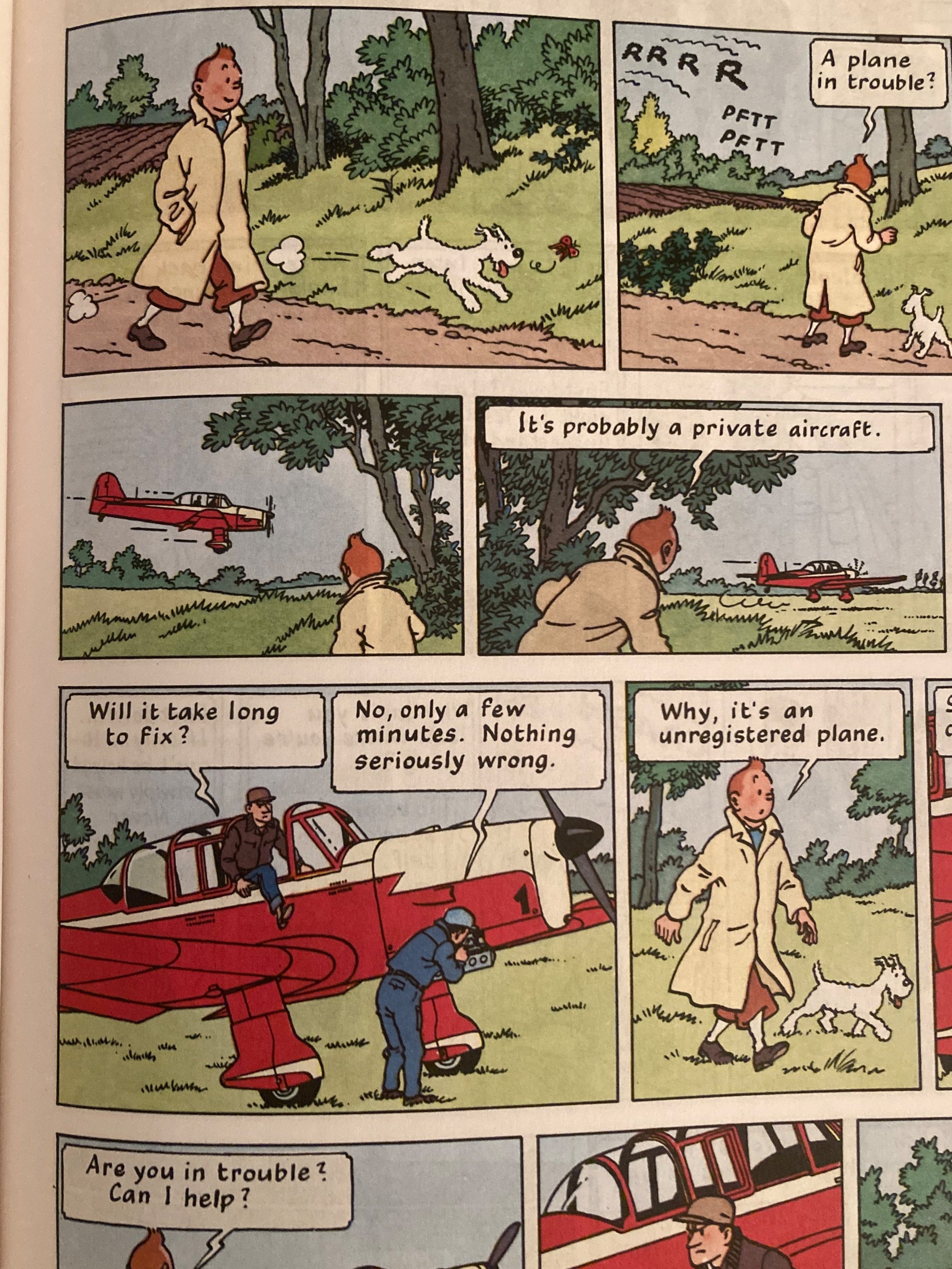
The linework in Tintin is deceptively simple. I love the elegance of the drawings, the use of color, and have always been especially fond of the lettering
Additionally one of my big inspirations the last few years has been the work of E M Carroll. They wrote an exquisite collection of horror stories called ‘Through the Woods’ and I was entirely enchanted by their character design and their ingenious use of color and negative space. The illustrative qualities of each of their works is magical and immersive.
At the library I found a full length graphic novel they published called ‘a Guest in the House’, which tells the story of a newly married woman who begins to grapple with the dark underside of her new life— and with the spirit that occupies her house.

Emily Carroll’s ‘a Guest in the House’ is written in gorgeous black and white greyscale that is sporadically flushed with color. The story took my breath away!
Meanwhile, as I’ve been collecting and reading I’ve been trying to make a steady practice of scribbling and practicing new ideas in my own notebooks. There are a few things I’m working hard to brush up on now— figure drawing, proportional and realistic hands and feet, stylized characters and consistency in design. One of the things that has most challenged me to date is drawing one character repeatedly and in different poses, angles, moods, expressions, clothes— all in a way that is readily recognizable and more or less uniform. It’s astonishingly difficult!
I will have more notes to share on this process and how it’s going but for now I think this post has gone on quite long enough. I’ll be in touch soon with more updates. Thank you for reading! Wishing you all the best,
paix,
John Mark

